Navigation Bar
Header
Buttons
Jumbotron
Footer
Tick box
Navigation bar
The navigation bar is used for getting around the site or app.
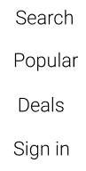
Above shows an example of the navigation bar
Location
The navigation bar must be on the home page of the app located in the middle of the screen.
For the website it must be located at the left side of the screen this allows room for more buttons.
Text and Colour
Font: Roboto
Size: 36
Colour: Light black #000000
Text location: Centred and 40 bits apart
Background
Below shows an example of a background being used with the navigation bar.
Colour user over image Linear Hex, #CCCCCC 100%

Button example

Code css
Header
The header is used to show the title of the page and a method to get back to the navigation page
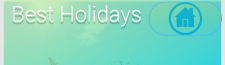
Above shows an example of the header
Location
The header must be located at the top of the page.
Text
Font: Roboto
Size: 36
Colour: Light #FFFFFF
Text location: Top left
Effect: Drop shadow
Colour
Linear 100%
Left: #FFE600 0%
Right: #00E0FF 100%
Button
Location: Top right
W:121 H:56 Corner:60
Link: Navigation page
Code:
Code:
Code css
Buttons
Information regarding all buttons can be found below
Button 1
Use: Loading reviews or other information on new page
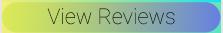
Location
Button must be located below related content
Text
Font: Roboto
Size: 36
Colour: Thin black #000000
Text location: Centred
Effect: None
Colour
Linear 100%
Left: #D7F522 50%
Right: #5869FC 100%
Size
W: 360
H: 50
Corner: 60
Code html:
Code css
Button 2
Use: Home button links to navigation page

Location
Button must be located at top right of page or within jumbotron
Colour
Linear 100%
Left: #FFF508 100%
Right: #66E800 0%
Size
W: 121
H: 56
Corner: 60
Code:
Code css
Button 3
Use: Takes the user to the next page when following a set path
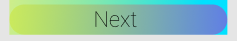
Location
Bottom of pages that require it, pages that take the user on a path,
example would be a user booking a holiday
Text
Font: Roboto
Size: 36
Colour: Thin black #000000
Text location: Centred
Effect: None
Colour
Linear 100%
Left: #D7F522 50%
Right: #5869FC 100%
Size
W: 360
H: 50
Corner: 60
Code:
Code css
Button 4
Use: Takes the user back a page when following a path

Location
Button must be located at the top of pages that require it,
pages that take the user on a path, example would be a user booking a holiday
Text
Font: Roboto
Size: 36
Colour: Thin black #000000
Text location: Centred
Effect: None
Colour
Linear 100%
Left: #D7F522 50%
Right: #5869FC 100%
Size
W: 360
H: 50
Corner: 60
Code:
Code css
Button 5
Use: Text buttons within jumbotron

Location
Button must be located below content of jumbotron but within
Text
Font: Roboto
Size: 36
Colour: Thin #010301
Text location: Centred
Effect: None
Size
W: 180
H: 43
Corner: None
Code:
Code css
Button 6
Use: Loading more related content
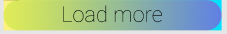
Location
Button must be located at bottom of page where more content can be loaded
Text
Font: Roboto
Size: 36
Colour: Thin black #000000
Text location: Centred
Effect: None
Colour
Linear 100%
Left: #D7F522 50%
Right: #5869FC 100%
Size
W: 360
H: 50
Corner: 60
Code:
Code css
Button 7
Use:Next image button

Location
Button must be within image at top right corner
Colour
Fill 100% #97E8E8
Size
W: 30
H: 50
Corner: 3
Rotation: -90
Code:
Code css
Button 8
Use:Go to previous image

Location
Button must be within image at top left corner
Colour
Fill 100% #97E8E8
Size
W: 30
H: 50
Corner: 3
Rotation: 90
Code:
Code css
Jumbotron
The jumbotron used as a box on screen that holds button for a set task
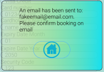
Above shows an example of the jumbotron
Location
The jumbotron is used when a box is needed that can load other content
this would be located above or below starting content,
example once the user has finished booking a holiday a jumbotron
can be used to give the user a box with some text and a button
Text
Font: Roboto
Size: 18
Colour: Light #000000
Text location: Top within jumbotron
Effect: None
Colour
Linear 100%
Left: #00E0FF 100%
Right: #FFe600 0%
Button
Location: Below text
W:121 H:56 Corner:60
Link: Navigation page
Code:
Code:
Code css
Footer
The footer is used at the bottom of the page and holds social links

Above shows an example of the Footer
Location
The footer is located at the bottom of the page below all other elements
Colour
Linear 100%
Left: #00E0FF 100%
Right: #FFe600 0%
Button
Location: From left to right of footer
W:50 H:50
Link: Social links
Code
Code css
Example of button

Code
Tickbox
The tickbox used as a simple box for yes or no
Above shows an example of the tickbox
Location
The tickbox is located next to questions where the user can put yes or no
Size
W:25 H:25
Colour
Stroke 100% #000000
Code
Welcome to the simple Pattern Library to view elements use buttons on the side panel